So, you’ve got an idea brewing for custom t-shirts, hoodies, or promotional gear. Maybe it’s for your band’s next tour, your company’s team-building event, or simply to show off your unique style. Whatever the occasion, you want your design to pop, to grab attention, and to look fantastic. That’s where smart design tips for screen printing come into play.
Screen printing is an incredible art form, capable of transforming a plain garment into a vibrant canvas. But to get the best results – the kind that makes people ask, “Where did you get that?!” – you need to understand how your design translates to ink on fabric. Don’t worry, you don’t need to be a design guru to make your vision a reality. With these expert design tips for screen printing, you’ll be well on your way to creating apparel that truly stands out.
How Screen Printing Works for Your Design
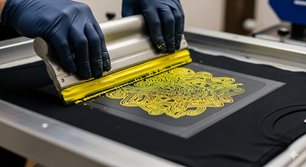
Before diving into the nitty-gritty of design, it’s helpful to remember the basics of screen printing. Essentially, ink is pushed through a mesh screen onto the fabric, with a different screen used for each color. This process is fantastic for creating bold, vibrant, and durable designs.
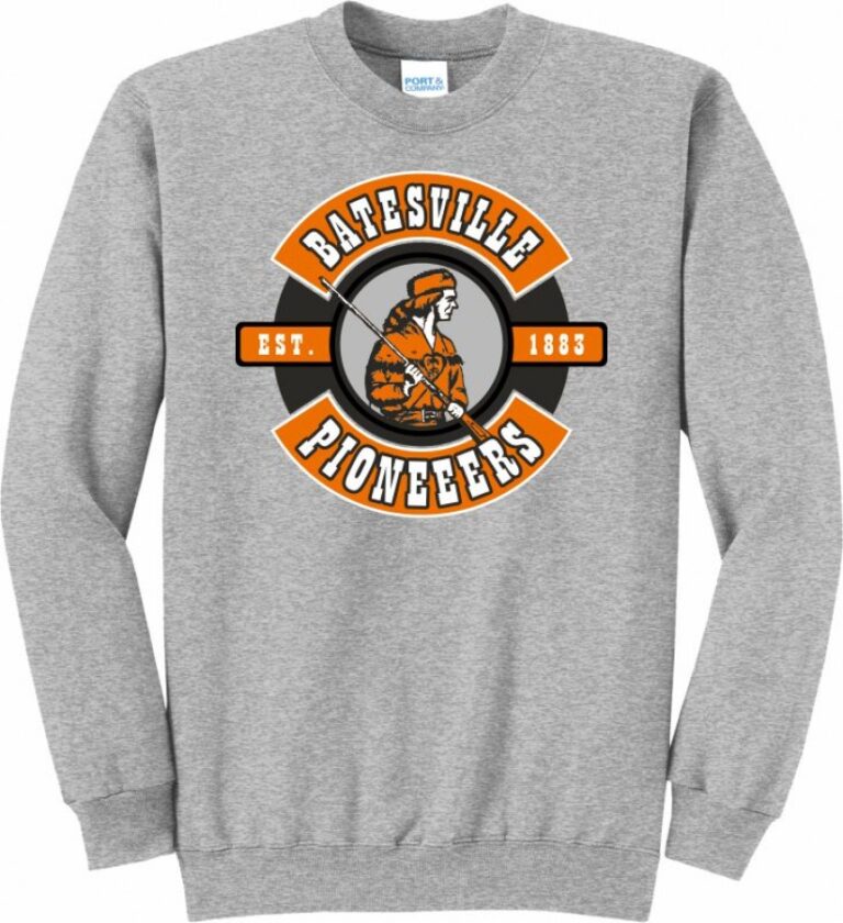
This fundamental understanding influences every aspect of your design, from color choices to line thickness. Knowing these principles will save you time, money, and potential headaches, ensuring your finished product from our Screen Printing Services in Searcy, AR or Batesville, AR looks exactly as you imagined.
The Top 5 Design Tips for Screen Printing
Tip #1: Embrace Simplicity – Less is Often More!
It’s tempting to cram every cool idea into one design, but when it comes to screen printing, simplicity is often your best friend.
- Clean Lines & Shapes: Screen printing excels at reproducing crisp, well-defined lines and shapes. Overly complex, tiny details or intricate gradients can sometimes get lost or muddy when translated to ink. Think bold.
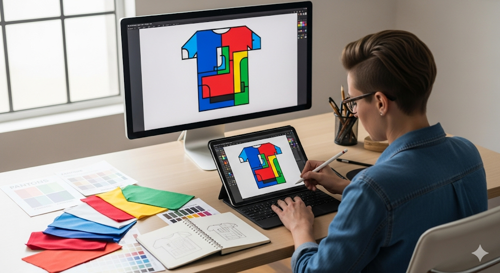
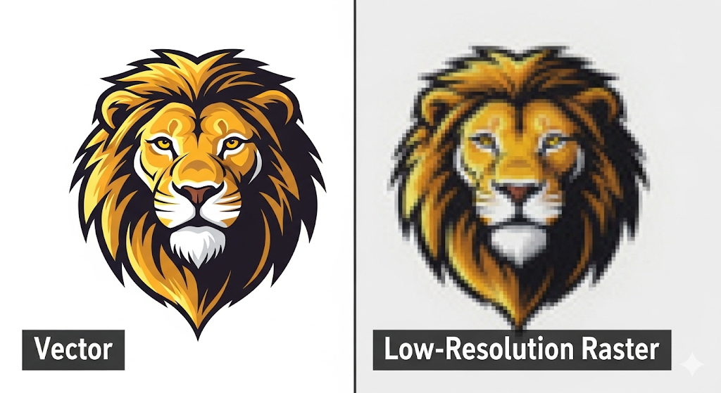
- Vector Graphics are King: Always aim to create your artwork as a vector graphic (e.g., in Adobe Illustrator). Unlike raster images (like JPEGs), vector files can be scaled to any size without losing quality, ensuring sharp edges and clear details. If you’re working with raster, make sure your resolution is high – at least 300 DPI at the final print size.
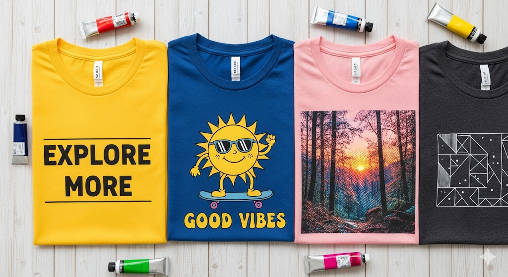
- Minimalist Designs Pop: A powerful logo or message with minimal clutter often has a much stronger visual impact than a busy one. It’s easier to read, more memorable, and generally prints cleaner.
Tip #2: Be Strategic with Your Color Palette
Color is where your design truly comes to life, but with screen printing, it’s also a major factor in cost and complexity.
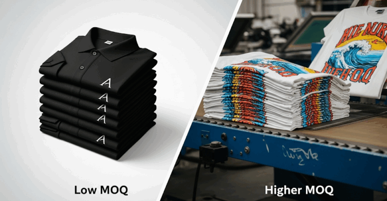
- Fewer Colors = Lower Cost: Remember, each color in your design requires its own screen. So, a 1-color design is significantly more affordable than a 6-color design. Can you achieve your desired look with 1, 2, or 3 colors instead of 5 or 6?
- Choose High-Contrast Colors: To ensure your design stands out, pick colors that contrast well with both the garment color and each other. Black on white is a classic for a reason, but experiment with other combinations that offer good readability and visual appeal.
- Consider Garment Color as a “Free” Color: A smart design tip for screen printing is to incorporate the garment color into your design. For example, if you’re printing a black and yellow logo on a black shirt, you only need yellow ink – the black of the shirt acts as one of your design colors!
- Pantone Matching System (PMS): If color accuracy is critical for branding, specify PMS colors. This ensures your specific shade of blue or red is reproduced consistently across all prints.
Tip #3: Mind the Details: Text, Line Thickness, and Halftones
The devil is in the details, and with screen printing, those details can make or break your design.
- Readability is Key for Text: Make sure your fonts are clear and legible. Avoid overly thin or ornate fonts, especially for small text. A good rule of thumb is that lines should be at least 2 points thick. Anything thinner can be difficult to hold on the screen and print consistently.
- Minimum Line Thickness: For effective screen printing, try to keep all lines in your design at a minimum thickness of 0.015-0.02 inches (roughly 1-1.5 points). Lines thinner than this can “fill in” or “wash out” during the printing process.
- Halftones for Gradients: Want a gradient effect without adding a ton of colors? Halftones are your secret weapon! They use tiny dots of varying sizes to create the illusion of different shades or gradients with a single ink color. This is one of the brilliant design tips for screen printing to save costs while achieving a sophisticated look. Your printer can help you convert your design to halftones.
- Trapping: This is a technical detail your printer usually handles, but it’s good to know. Trapping is a slight overlap of colors to prevent gaps between different colored areas if the garment shifts slightly during printing.
Tip #4: Placement, Size, and Proportion
Where and how large you place your design dramatically impacts the final look and feel of your custom apparel.
- Standard Print Locations: Familiarize yourself with common print locations: full front, left chest, full back, sleeve, upper back, etc. Each location has standard dimensions for optimal visibility and aesthetic balance.
- Size Appropriately: A design that looks great on a small left-chest print might be too sparse for a full back. Conversely, a large, intricate full-back design might look awkward if scaled down too much for a left chest. Consider the garment size – a design that fits a medium shirt might be too small for an XXL or too large for a youth small.
- Proportion is Power: The design should be proportionate to the garment and the human body. Hold your design up to a shirt to visualize how it will look. Don’t be afraid to ask for a digital mock-up from your printer (like us at VanWinkle Sports Custom Screen Printing) to see how it will truly appear.
Tip #5: Consider the Fabric and Ink Type
The type of garment you choose influences how your design will print and look.
- Fabric Composition: 100% cotton is a screen printer’s dream, offering excellent ink absorption. Blends (like 50/50 cotton/polyester) also print well. Polyester and tri-blends require special ink additives or inks to prevent “dye migration” (where the garment’s dye bleeds into the ink color).
- Ink Types:
- Plastisol Inks: The most common type. They are vibrant, opaque, and durable. They sit on top of the fabric and have a slightly rubbery feel, though “soft hand” additives can reduce this.
- Water-Based Inks: These soak into the fabric, creating a super soft feel (often called “no hand”). They are great for vintage looks but are less vibrant and work best on lighter colored garments.
- Discharge Inks: A type of water-based ink that removes the dye from the garment’s fabric (for 100% cotton dark shirts) and replaces it with the ink color. It results in a very soft, natural feel.
Discussing your fabric choice with your printer is one of the crucial design tips for screen printing success. We can advise on the best ink type for your desired look and feel.
Bringing Your Design to Life: The Partnership with Your Printer
The best design tips for screen printing involve a collaborative effort. While you’re the creative visionary, your screen printer is the technical expert.
- Communicate Clearly: Provide your design in the highest quality possible (vector files are ideal!). Clearly state your desired colors, placement, and any specific concerns.
- Ask for Mock-Ups: Always request a digital mock-up before production begins. This visual representation ensures everyone is on the same page.
- Trust Their Expertise: A good screen printer, like the team at VanWinkle Sports, can offer invaluable advice on how to optimize your design for the best print quality and cost-effectiveness. We’re here to help you navigate the process from concept to completion!
What Should You Not Do When Designing for Screen Printing?
Just as important as knowing what to do is knowing what to avoid. Steer clear of these common pitfalls to ensure a smooth printing process and a fantastic final product.
- Don’t Submit Low-Resolution Artwork: This is the number one issue printers face. A blurry, pixelated image will result in a blurry, pixelated print. Avoid pulling images directly from Google or a website. Always start with the highest quality file possible (300 DPI or a vector file).
- Don’t Go Overboard with Colors (Unless Budget Allows): It’s easy to get carried away in a design program, but every color you add increases the cost and complexity. A beautiful 8-color design might not be feasible for a 50-shirt run. Think strategically about your color palette from the start.
- Don’t Forget About the Fabric: A design that looks amazing on a white 100% cotton tee might look completely different on a dark, tri-blend hoodie. Don’t forget to account for how ink interacts with different fabric types and colors.
- Don’t Make Text Too Tiny or Thin: While it might look fine on your 27-inch monitor, tiny text can become an unreadable smudge when printed. The same goes for super-thin lines. When in doubt, make it a little bolder and bigger.
- Don’t Design in Isolation: The best results come from collaboration. Don’t finalize your design without talking to your printer. A quick conversation can save you hours of redesigning and ensure your concept is perfectly optimized for printing.
Frequently Asked Questions (FAQs) About Screen Printing Design
Here are quick answers to some of the most common design-related questions we receive.
1. What is the absolute best file format for a screen printing design?
The gold standard is a vector file, such as an Adobe Illustrator (.ai), .eps, or .svg file. Vector files are made of mathematical paths, which means they can be scaled to any size without losing quality. If you must use a raster file (like a .psd or .png), ensure it’s created at 300 DPI (dots per inch) at the exact size you want it printed.
2. Why can’t I just print one shirt with a 5-color design cheaply?
Screen printing has significant setup costs. For a 5-color design, a printer has to create five separate screens, mix five different ink colors, and align them all perfectly on the press. This setup process is the same whether you’re printing one shirt or 100 shirts. The cost is absorbed across larger orders, making the per-item price much lower for bulk quantities.
3. Can you screen print a photograph on a shirt?
Yes, absolutely! This is achieved using a process called four-color process (CMYK) or simulated process screen printing. Your photograph is separated into different color layers (or halftones) that, when printed on top of each other, blend to recreate the full spectrum of colors in your original image.
4. What’s the easiest way to make my design more affordable to print?
The simplest way is to reduce the number of colors in your design. See if you can achieve a similar impact with two colors instead of four. Another great way is to increase your order quantity; the more shirts you print, the lower the cost per shirt will be.
5. How durable is a screen-printed design?
When professionally printed and properly cured, a screen-printed design is extremely durable. The ink bonds with the fabric and should last for years, often outliving the garment itself without cracking or fading, provided you follow proper washing instructions (wash inside out, use cold water).
Ready to Print Your Masterpiece?
Crafting a standout design for screen printing doesn’t have to be daunting. By focusing on simplicity, strategic color use, attention to detail, thoughtful placement, and understanding fabric/ink interactions, you’re setting yourself up for success.
Whether you’re starting from scratch or refining an existing logo, remember these design tips for screen printing to ensure your custom apparel turns heads and lasts for years.
Ready to see your design come to life? Explore our Custom Screen Printing Services in Batesville & Searcy, AR today, or contact us directly to discuss your project. Let’s create something awesome together!